Redesigning UnlockLife App
A digital wellness platform
for senior citizen
Product
UnlockLife - Holistic Health club for seniors
Role
Founding Product Designer
Team
Designer, 2 Engineers, Ops team, Founders
Platform
Android & IOS
What is UnlockLife?
UnlockLife is a digital companion designed for senior citizens in India, offering a holistic health experience through live online events, an AI companion called Shravan, and community activities all from the comfort of home.

55+
Target user age group in India
10K+
App downloads
2X
Conversion rate
Problem Statement
As UnlockLife expanded its offerings, the product got cluttered making it harder for seniors to use the app. This project focused on redesigning the core user journey to improve discoverability, engagement, attendance, and membership conversion.

Challenge
Designing for an audience that's new to smartphones — where every extra tap, every unclear label, every "where do I go next?" moment costs trust and attendance.
Discovery
Before any redesign work started, I wanted to understand why seniors were struggling not assume it. So I did 1:1 with team like talking to the people who deal with users every day (Customer service), and the people who set business direction (Founders) and also attended some live sessions.
Insights
- Some seniors had registered but simply forgot to join on time
- Hosts used to send reminders on whatsapp via manually
- New users repeatedly asked where to find today's activities and ticket
- Introduce our new product AI Shravan
- Introduce memberships for online sessions
- Create an easy flow for seniors to make payments
- Went screen by screen on the existing app to flag usability issues
- Events page should convey that activities are designed for improving holistic health
- Simplify the user journey from interest to action
- More options didn't help it added friction. Seniors preferred being guided to one obvious next step.
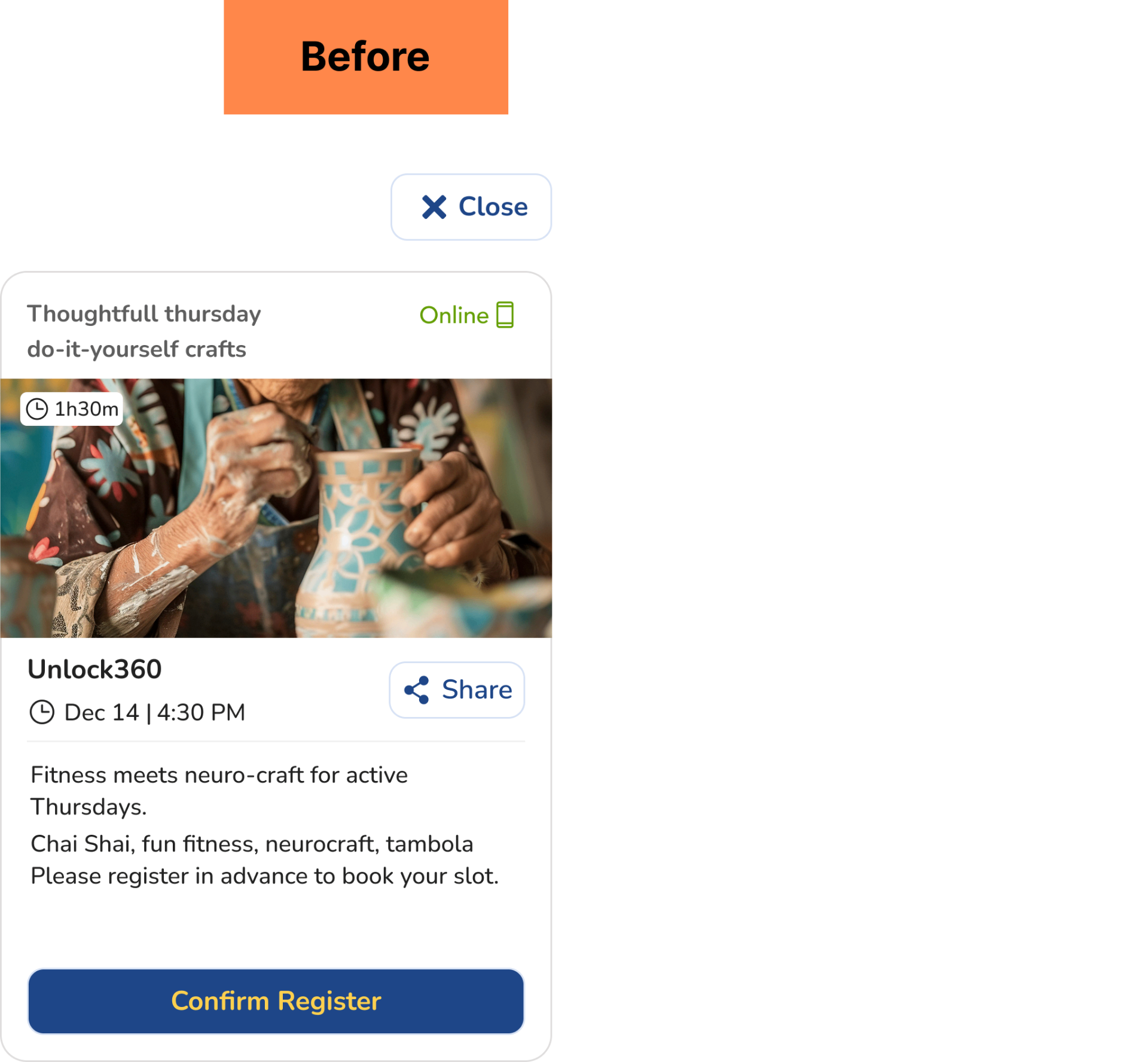
Let's see the audit of old App screens
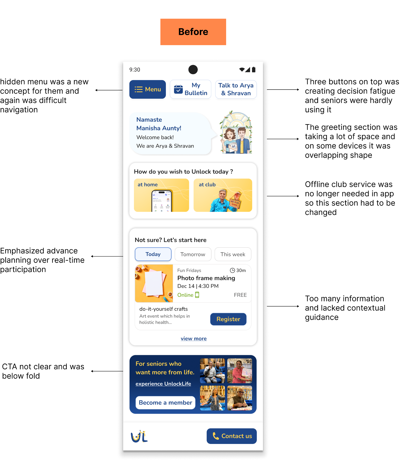
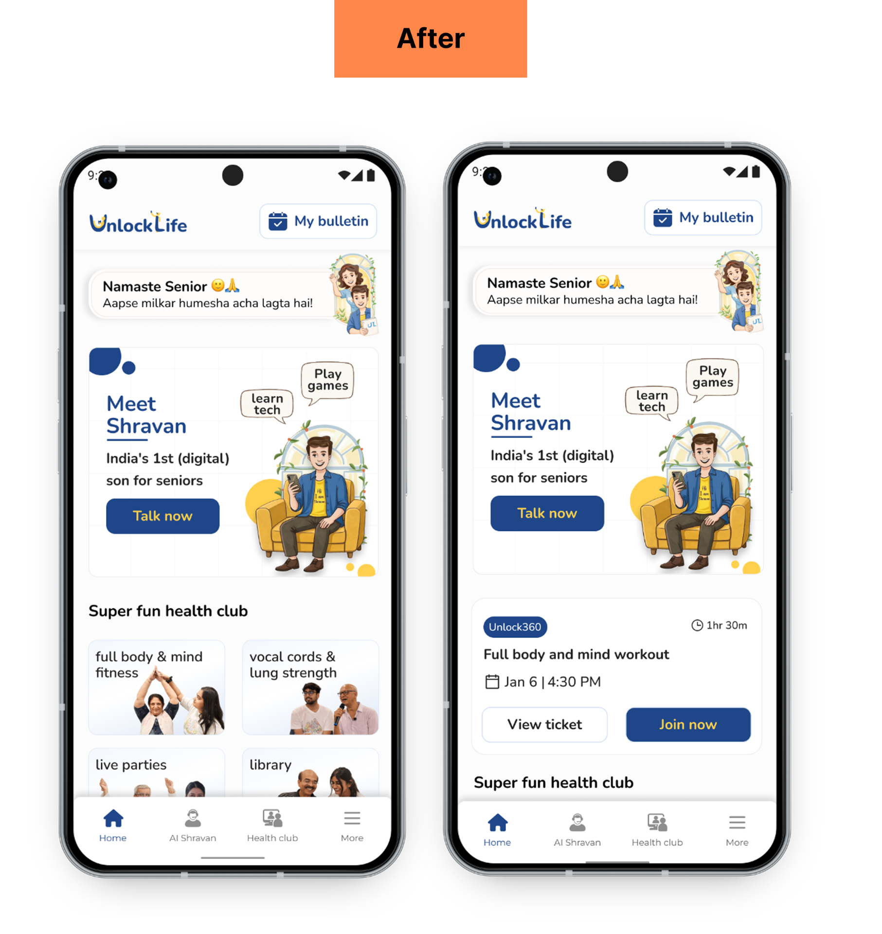
- Reduced Decision Fatigue: Removed multiple competing actions and prioritized My Bulletin—the destination seniors used most to track registered events.
- Improved AI Discoverability: Prominently surfaced AI Shravan, making the platform's newest offering easier to discover and access.
- 0-Step Access to Event Details: Brought View Ticket directly onto the live event card, eliminating the 2 step hidden navigation that was earlier.
- Clearer Value Proposition: Introduced Super Fun Health Club and wellness categories to help users understand how activities support holistic wellbeing.
- Personalized Event Discovery: Added category-based entry points, allowing seniors to browse only the activities relevant to their interests.
- Visible Navigation: Replaced the hidden hamburger menu with bottom navigation, making key sections easier to find and access.
Online events page audit
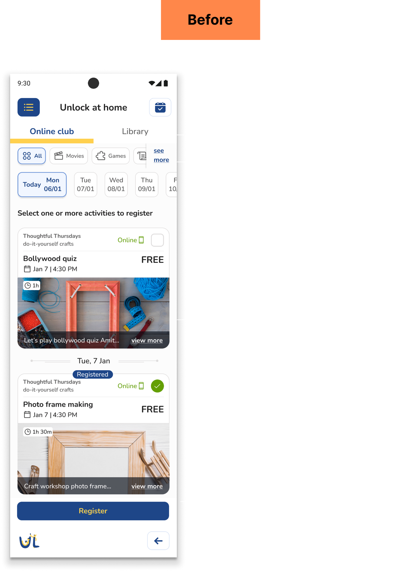
- Toggle of two products removed: Live sessions and on-demand videos serve different intents, separating them gave each page a single, clear purpose.
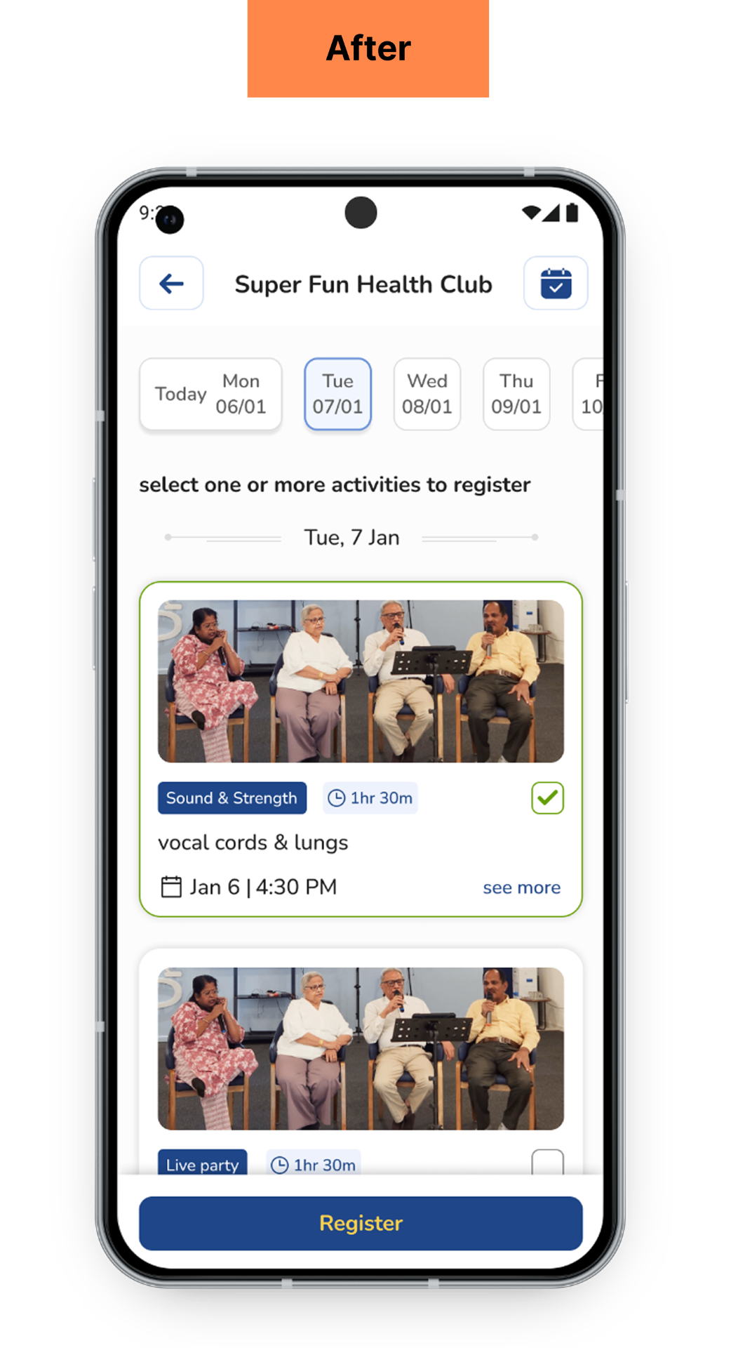
Event card simplified:
- Words like "Online" and "Free" labels were removed because every event is online and requires membership so repeating same on every card was not required
- In older version each card used to show a label, a theme, and a topic — three names for the same event, none of them meaningful to a senior. So I kept only the topic name.
- Unreadable description teaser removed — if it can't be read, it isn't helping and also added multi event registration checkbox.
- Real photos of seniors: Replaced generated images — helped build trust faster, reduced team effort.
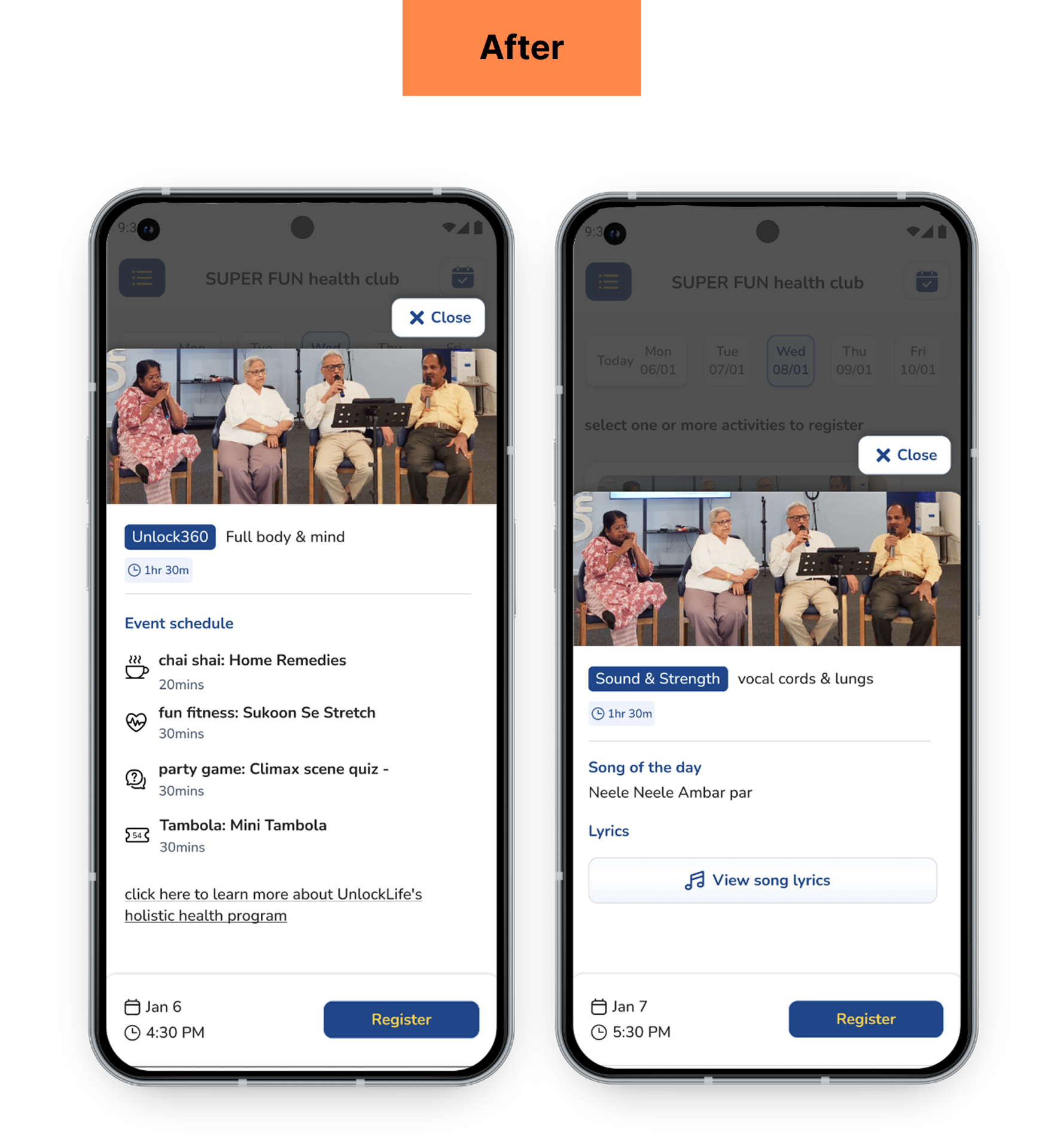
- Structured event schedule: chai shai, fitness, quiz, and Tambola, each with its own icon and duration. Helped user clearly understand event schedule.
- For Vocal cords events I added a new button where within the app users can see the song for the day. Initially we used to send on WhatsApp so customer support team's efforts reduced.
Solving the gap between registration and attendance
As per our data we used to see gap in number of registration vs the attendance during the online event and the gap was between intent and memory, not intent and action.
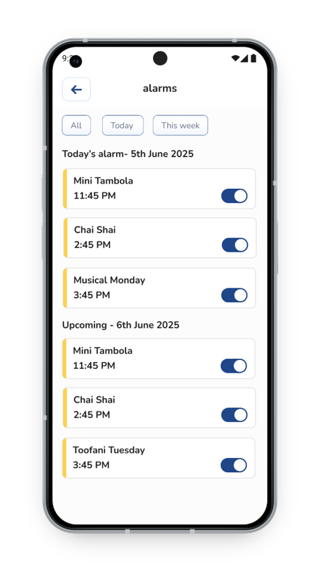
- Alarm auto-set on registration: The moment a senior registers for an event, a reminder is scheduled 10 minutes before the session. Zero additional effort — the system handles it unless they actively switch it off.
- Toggle control - on or off: No editing, no rescheduling, no complex options. One decision per alarm — something that was easy for seniors to do if they didn't need a reminder.
- Reduced dependency on the host: Before, hosts were manually reminding members every week before this existed. As the number of users were growing, this was not feasible — and that operational burden moved into the product feature.
Introducing Membership on App
Building trust before asking for money
When we introduced membership, the challenge wasn't just designing a paywall — it was designing for an audience that is inherently skeptical of digital payments. The entire funnel was sequenced around one principle
"Earn trust before asking for commitment"
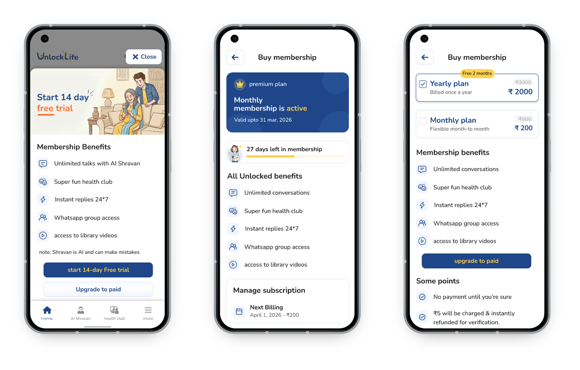
- • Reduced commitment anxiety with 14 day free trial
- • Highlighted membership benefits upfront to build confidence
- • Simplified pricing plan to just two plans
- • Transparent subscription management — Surfaced plan status, days remaining, next billing date.
- • Made cancellation easy to find, reinforcing trust and giving users confidence to commit.
- • Users appreciated the reduced distractions and simplicity in the event flow
- • "Earlier I used to call and ask where my ticket is — now I can see it right there" — a senior member said this, after the home screen update.
- • After the Alarm feature was released our team noticed some amount of increase in attendance — in fact some of them joining before time.
- • Several seniors were able to make membership payments on their own without the customer service help.
Outcome after the release
10,000+
App downloads
25%
Increase in attendance
30+
Memberships in 1 week after release